“I have been especially influenced by the use of color of the painters, Chaim Soutine, Pierre Bonnard, Henri Matisse, Vincent Van Gogh, and generally by the paintings of the Impressionists, Post-Impressionists, and Expressionists periods. The power and emotion that their colors convey resonates with me.”
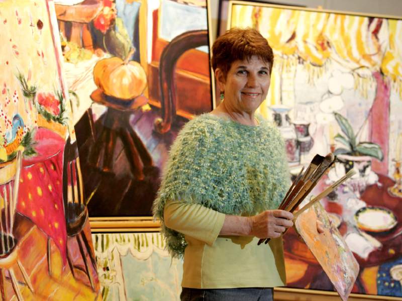
Marilyn Sommer’s oil paintings are bursting with color. She is able to pull together a composition largely through her ability of playing one color against another. Sommer’s versatility is displayed in her adept handling of still lifes, landscapes, figurative works and interiors.
 Sommer began painting as a child with her watercolor sets. She grew up in Boston, Massachusetts where she was surrounded with multiple, rich images and cultural diversity. She recalls being taken by her parents to many places within the city where she would “bump into land/cityscape images and ideas.”
Her parents’ encouragement of her enjoyment in painting has had a strong influence as well as being raised in a culturally diverse neighborhood with excellent museums available for viewing works of art. Sommer graduated from Columbia University Graduate School, and moved in 1970 to Northern California where the proliferation of her work is a testament to her ever rising art spirit. After Columbia, she continued to study art in Santa Rosa with Maurice Lapp and Michael Loffredo.
Marilyn’s work has been featured in galleries, wineries, restaurants, Chamber of Commerce brochures, television and is in over 250 private and corporate collections. A member of several art councils, Marilyn’s work has been at the San Francisco Design Center. Her painting adorned the label of the previous Robert Mondavi Winery, the Michael and Isabel Mondavi Folio Wine Company wine, “I’m Rose Cabernet Sauvignon.” She has been a guest artist at the prestigious and premiere Gallery at Robert Mondavi Winery in Napa, Ca.
Her artwork has been represented by MB Designs, Ltd. in New York City as well as Objectiques in Beacon, N.Y. The art has been commissioned by the Ritz Carlton Hotel in New York City for their BLT Market restaurant headed by Chef Laurent Tourondel, as well as other corporate and private patrons. Marilyn’s oeuvre had
also been selected as part of a museum exhibition on Cape Cod, Massachusetts. Her work is currently on display at the Lori Austin Gallery, Sonoma County, Ca.
 For Sommer color plays a crucial role in most cases in her work. Although composition is important, it is defined by her passionate use of color. “Though I grew up in the culturally rich milieu of a cosmopolitan city, my general remembrances and impressions were of seeing the world as though through a black and white television, experiencing the drabness and ugliness I perceived in the old, broken down tenement buildings of my growing up neighborhoods.” It wasn’t until I arrived in California that I experienced an almost Dorothy in The Wizard of Oz scenario of viewing vivid color all around me as though for the very first time.
 “I always look for what is most beautiful for me. Now, fortunately, I can begin to find this beauty in the most common, everyday scenes. I feel an urgency in the joy of painting, and also an urgency to paint because of time’s restraints.” Sommer begins painting by using a minimal line drawing in a very light color. This generally establishes the composition. She may place a wash over the entire canvas, or proceed directly to painting after the line drawing is accomplished. After this step is completed, she charges in with pigment, working the entire canvas at all times.
“My colors come from my reaction to the reality I am faced with as well as to how what I see makes me feel. I don’t plan the color ahead of time. I react immediately to what I feel about what I am seeing, and the color is then applied and moved on the canvas in this context.” What the viewer sees many times is a thick, textural painting exploding with color dominating and determining the composition. Perspective is also overshadowed by this explosion. What one experiences is a vibrant bath of hues that pulls the viewer into the canvas. Sommer often produces plein air paintings in the tradition of the Impressionists in this same described manner.
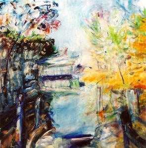
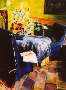
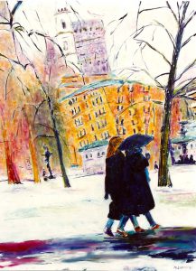
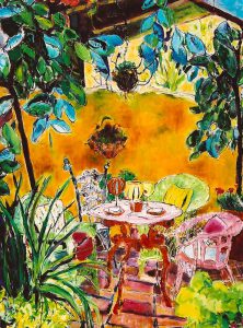
 Landscapes, figurative works, interiors, and still lifes are all rich sources of inspiration as well as a particularly expressive image from dreams or memory. She is greatly affected by the seasons, and her canvases generally seem to reflect the season in which she is actually living.
Landscape paintings can be restful as well as energetic and full of spirit. Figurative and interior paintings have strong emotional tones, and the viewer is projected into the canvas full force. One such painting is entitled, “Chloie’s Chair.” The image of the overstuffed, well worn, green chair is of a large hand, centrally placed; pink, orange, blue swirl around the chair. A tiny bit of pink is especially significant, and adds a tension in an otherwise harmonious piece. Sometimes, she may do a series of paintings on the same subject as in fact she has done with “Chloie’s Chair”, or she may use one painting as a stimulus for the next or future work.
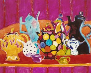
 Sommer also utilizes children’s art as a stimulus for her work. She draws from art work which her son had created. Again in the case of her son’s pencil drawing of “Chloie’s Chair”, she reinterprets and simplifies shapes and forms even more. In regards to the still lifes, they are like a giant maze of color. Each corner and section is alive with texture. Any section could be broken off and it would stand by itself as a complete painting. While Sommer’s paintings are not abstract, her distillation of forms moves in that direction. “I would like the viewers to take from my work that which touches the humanity in them. My reaction to what I see and then paint feels quite direct, and that is what I am trying to convey on the canvas.” With the versatility Sommer displays, we can only continue to look forward to seeing her work, and enjoy the explosion of her palette upon us.